
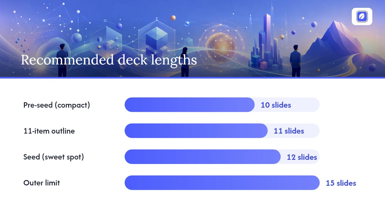
The ideal early-stage pitch deck typically runs around 10 to 12 slides, with 15 as an upper limit. The canonical order is: Title/Vision, Problem, Solution, Product, Market Size, Traction, Business Model, Competition, Go-to-Market, Team, and The Ask, with a separate appendix for backup data. Every slide after this article breaks down exactly what belongs on it and why investors care.
TL;DR:
- A pitch deck should have no more than 12 slides, with 10 to 12 being ideal for most early-stage funding rounds.
- Focus on creating a defensible, bottom-up market size calculation and validated traction evidence to strengthen your presentation.
- Highlight your strongest signals first, such as traction or founder-market fit, rather than defaulting to problem slides.
- Maintain clarity by keeping one idea per slide and matching chart types to the story to ensure investor understanding.
- Continuously update your deck based on investor questions and feedback to address gaps in your evidence before funding discussions.
Table of Contents
- What Should a Pitch Deck Outline Include?
- Slide-By-Slide Breakdown: What to Include and How to Present It
- How Do You Decide Which Slide Goes First?
- Design and Storytelling Rules That Keep Slides Clear
- Common Pitch Deck Mistakes and How to Fix Them
- What Belongs in the Pitch Deck Appendix?
- Phase‑0 Clarity: Turning Structured Inputs Into Slide-Ready Content
- What Actually Matters Once You Start Presenting
- How Klaritea Turns a Fuzzy Idea Into Deck-Ready Numbers
- Sources
- FAQ
What Should a Pitch Deck Outline Include?
Copy this list into Google Slides or PowerPoint and fill in your specifics. Each slide has one job. Do that job, then move on.
- Title/Vision: your company name, one-line pitch, and the world you're trying to create.
- Problem: the specific pain your ICP feels today, with a cost or frequency attached.
- Solution: how you fix it, in plain language, without listing every feature.
- Product: what it actually looks like, ideally a screenshot or short demo GIF.
- Market Size: TAM/SAM/SOM built from the bottom up, not a Gartner report.
- Traction: the number that proves people want this, growth trend included.
- Business Model: how money moves, unit economics, and pricing logic.
- Competition: who else solves this and why you win on a specific axis.
- Go-to-Market: how you'll acquire your first 100 and next 10,000 customers.
- Team: why you three are the ones who solve this problem.
- The Ask: how much you're raising, at what terms, and what it buys you.
This eleven-item list matches the structure most high-converting early-stage decks follow, and it's flexible enough to compress or expand depending on your stage and audience.
Ten slides works for a pre-seed round where the story is simple: merge Competition into the Market slide as a quick callout, and fold Go-to-Market into Business Model. Twelve slides is the sweet spot for seed-stage decks with real traction data worth its own slide, plus a short Vision or "Why Now" slide up front. Fifteen is the outer limit; anything longer and you're forcing investors to hunt for the point, which is the opposite of what a pitch deck is for.
Slide-By-Slide Breakdown: What to Include and How to Present It
Each slide answers one question. Investors spend the bulk of their limited review time on Financials, Team, and Traction, so those three deserve the sharpest data and the cleanest visuals in the whole deck.
-
Title/Vision slide. State your one-liner and the category you're creating or disrupting. Skip the mission-statement paragraph. Use a single bold sentence: "We help X do Y without Z." A clean logo, your name, and contact info round it out. No chart needed here, just typography that doesn't look like a Word document.
-
Problem slide. Name the specific person who has this problem and quantify what it costs them, in hours, dollars, or churn. Three bullets max: who suffers, how often, and what they're forced to do instead (a workaround, a spreadsheet, a competitor's clunky tool). A single stat works better than a paragraph. If you have a customer quote that captures the pain in one sentence, use it here instead of on the traction slide.
-
Solution slide. Explain your fix in one sentence, then show, don't tell. This is where a before/after comparison or a simple two-column table (old way vs. your way) does more work than prose. Avoid listing ten features. Investors want to know you understand the mechanism of change, not your full roadmap.
-
Product slide. A real screenshot beats a mockup every time. If your product isn't built yet, show wireframes and label them clearly as such. A 15-second embedded demo video, or a link to one, often outperforms static images because it proves the thing works. This slide's only job is to make the abstract concrete.
-
Market Size slide. Build your TAM/SAM/SOM from the bottom up: number of target customers times realistic price times expected penetration, not a $50 billion figure lifted from an analyst report. Investors consistently prefer defensible, assumption-backed math over impressive-looking top-down numbers they can't verify. State your assumptions in small text at the bottom of the slide, and move the full spreadsheet to the appendix.
-
Traction slide. This is where investor eyes go first, so make it count. Show a growth curve, not a static number. Monthly recurring revenue, active users, waitlist signups, or pilot conversions all work depending on your stage. Label the axes. Annotate any inflection points (a launch, a press hit, a pricing change) so the investor understands what caused the jump. If traction is thin, be honest and pair it with a strong "why now" instead of inflating vanity metrics.
-
Business Model slide. Show how a dollar moves through your business. Subscription tiers, transaction fees, marketplace take rate, whatever it is, put the actual price points on the slide. Include one unit economics line, like customer acquisition cost against lifetime value, if you have the data. If you don't yet, say so plainly rather than guessing.
-
Competition slide. A 2x2 matrix works better here than a bullet list because it visually shows your position rather than just asserting it. Pick two axes that actually matter to buyers (price versus depth, self-serve versus enterprise) and plot yourself and three to five real competitors. Investors already assume competition exists; pretending you have none is a bigger red flag than admitting rivals and explaining your edge.
-
Go-to-Market slide. Name your first channel and why you believe it works, ideally backed by an early result (a cost-per-acquisition number, a conversion rate from a small test). Investors want a specific plan for the next 6 to 12 months, not a list of every marketing channel that theoretically exists.
-
Team slide. Headshots, names, one line each on relevant background. The relevant part matters more than the impressive part; a decade at a big company means less than two years solving this exact problem for these exact customers. If you have notable advisors, list them here in smaller text, not as full team members.
-
The Ask slide. State the amount you're raising, the round type, and what specifically it funds (18 months of runway, three hires, a product milestone). Vague asks like "we're raising to grow" read as unprepared. Close with your contact information again since this is often the last slide investors screenshot.
Pro Tip: Write your eleven-slide headlines first, before touching design. If you can read them in sequence and they form one coherent argument, your structure works. If they read like unrelated facts, fix the outline before you fix the fonts.
How Do You Decide Which Slide Goes First?
Your strongest signal should open the deck, not always the Problem slide. Founders default to "problem first" because that's the template everyone's seen, but that's not always the strongest opener you have.
There's a real hierarchy worth working through before you lock your order:
- Exceptional traction: if you have a number that stops people (revenue growth, retention, a viral loop), lead with it right after your title slide.
- Founder-market fit: if you've personally lived the problem for a decade, or built the last three companies in this exact space, that story might outperform a generic Problem slide.
- Unfair access: an exclusive data source, a regulatory license, a distribution partnership nobody else can get.
- Vision, as a last resort: only lead with big-picture vision if you genuinely lack traction, team pedigree, or unique access, and even then keep it to one slide before moving into Problem.
There's no single correct order. Experienced pitch coaches argue that decks work best organized around acts, building the case, de-risking the bet, then widening the lens, rather than rigidly following a fixed template. Pick the structure that puts your best evidence in front of the investor before their attention drifts.
Before you touch design software, run this check: read your slide titles out loud in order. If a stranger could follow your argument from headline alone, your order works. If they'd get lost by slide four, move things around now, not after the deck is fully designed.
Design and Storytelling Rules That Keep Slides Clear
One slide, one idea. That's the rule that fixes most bad decks. If a slide tries to make two points, split it into two slides or cut the weaker point entirely.
Headline-first design means the top line of every slide states the takeaway in a full sentence, not a topic label.
For charts, match the chart type to the story: line charts for growth over time, bar charts for comparisons, a simple 2x2 for competitive positioning. Avoid pie charts with more than four slices and never stack more than two data series on one axis. If a chart needs a paragraph of explanation to be understood, it's the wrong chart.
Data hygiene matters as much as visual polish. Every number on a slide should trace back to a stated assumption or a real data source. If you're projecting SOM from TAM, show the math in small type at the bottom rather than asking investors to trust a big round number. Font size should stay readable at arm's length. Guy Kawasaki's 10/20/30 rule, 10 slides, 20 minutes, 30-point minimum font, was built for live pitching, and the font-size guidance still holds even when you're sending a deck for asynchronous review. Keep design consistent slide to slide: same font pairing, same color for positive metrics, same logo placement. Inconsistency reads as rushed, even when the content is strong.
Common Pitch Deck Mistakes and How to Fix Them
Most weak decks fail for a handful of repeatable reasons, and every one of them is fixable in an afternoon.
- Too many slides. If you're past 15, merge Competition into Market Size, or move a whole slide's content into the appendix and reference it verbally.
- Vague market sizing. Replace any TAM slide that just cites a market research number with a bottom-up calculation: target customers times price times expected share.
- A soft or missing ask. State a dollar figure, the round type, and exactly what it funds. "We're raising to grow" is not an ask.
- Traction buried on slide 9. If your growth numbers are strong, move Traction earlier since investors read decks nonlinearly and often jump straight to it anyway.
- Financials with no assumptions shown. Add a single line of stated assumptions under any revenue projection, or investors will assume you made the numbers up.
What Belongs in the Pitch Deck Appendix?
The appendix is where detailed backup material lives so your core deck stays lean. Investors dig into these slides during diligence or when a specific question comes up in the meeting, not during the first read.
Include your full financial model with monthly line items, cohort retention tables, technical architecture diagrams, detailed competitive teardowns, and customer reference lists. Heavy data that investors check later belongs here, not squeezed onto your Market Size or Traction slide.
Number appendix slides separately (A1, A2, A3) so you can reference them out loud: "That's covered in detail on A3 if you want to dig in." For email or DocSend sends, attach the lean 10 to 12 slide deck as the primary file and the appendix as a linked second document. Reserve the full combined deck for scheduled meetings where you control the pacing.
Phase‑0 Clarity: Turning Structured Inputs Into Slide-Ready Content

Most founders don't struggle with slide design. They struggle with not having defensible numbers to put on the slide in the first place: an ICP that's actually specific, a TAM built bottom-up instead of guessed, a competitor map that goes beyond three logos.
That's the gap a phase‑0 workflow is built to close. Klaritea takes a one-line idea and builds a connected model covering ICP, TAM/SAM/SOM, competitor analysis, features, and requirements before a single slide gets designed. Three AI advisors, covering marketing, business strategy, and operations, research and pressure-test the idea so the numbers on your Market Size and Competition slides hold up when an investor pushes back.
A pitch deck is only as strong as the model behind it. If your TAM slide is a guess and your competitor slide is three logos with no differentiation, no amount of slide design fixes that. Structure the model first, then let the deck follow from it.
Founders using this kind of upfront clarity work typically spend less time rewriting slides after a bad meeting, because the underlying assumptions were pressure-tested before they ever reached a deck. That's the whole premise of a phase‑0 workflow applied to a real 10-slide pre-seed deck: work the model, then build the slides on top of it.
What Actually Matters Once You Start Presenting
If you strip everything else away, three things decide whether a deck lands: the one-liner on your title slide, the evidence on your traction slide, and the clarity of your ask. Get those three right and a mediocre Competition slide won't sink you. Get them wrong and no amount of design polish saves the meeting.
The other thing founders underestimate is how much the deck should change after every real investor conversation. If three investors in a row ask the same question your deck doesn't answer, that's not a coincidence, that's a missing slide. Update the deck within a day of the meeting while the objection is still fresh, and keep a running appendix of the questions you keep getting so future versions answer them before they're asked.
— Karl
How Klaritea Turns a Fuzzy Idea Into Deck-Ready Numbers
This tool is a shortcut past the blank-slide problem that stalls most first-time founders before they've written a single deck slide. Instead of guessing at your TAM or copying a competitor's positioning, you type one line describing your idea, and a connected model, ICP, market sizing, competitor map, feature set, and build spec are built that feed directly into the slides investors actually read first.
That connected-model approach means your Market Size slide inherits real bottom-up math instead of a guessed number, your Competition slide reflects actual research instead of three memorized logos, and your Traction hypotheses are grounded in a defined ICP rather than "everyone will want this." If you've already read through how AI can support a clarity-first pitch deck workflow, the model behind Klaritea is what generates the raw inputs that workflow turns into slides. See how one connected model replaces scattered spreadsheets, and start building yours from a single line of text.
Sources
The slide count, order, and investor attention data in this article draw from ValueAddVC's guide to writing a pitch deck, Visual Hackers' pitch deck structure breakdown, the Holloway Guide's chapter on pitch deck elements, and Visme's overview of pitch deck structure, including the 10/20/30 rule. For budgeting the resources behind your ask slide, Tekkr's AI budget allocation checklist is a useful companion resource.
- How to Write a Pitch Deck That Actually Raises Money — ValueAddVC
- How to structure a pitch deck — Visual Hackers
- Elements of the pitch deck — Holloway Guide
- Pitch deck structure — Visme blog
FAQ
What Is the 10/20/30 Rule for a Pitch Deck?
Guy Kawasaki's 10/20/30 rule suggests 10 slides, a 20-minute presentation, and a minimum 30-point font. It's a solid heuristic for live pitching but less relevant for asynchronous email or DocSend reviews, which favor concise, evidence-first decks over strict slide counts.
What Is the Best Structure for a Pitch Deck?
The best-performing structure runs Title/Vision, Problem, Solution, Product, Market Size, Traction, Business Model, Competition, Go-to-Market, Team, and The Ask, in 10 to 12 slides total. Some founders reorder this to lead with traction or team if that's their strongest proof point.
What Are Three Essential Components of a Pitch Deck?
The three slides investors spend the most time on are Financials, Team, and Traction, so those three deserve your sharpest, most defensible data. A clear ask and a bottom-up market slide round out the components no deck should skip.
What Mistakes Should You Avoid in a Pitch Deck?
The most common mistakes are running over 15 slides, showing a top-down TAM with no supporting math, and closing with a vague or missing ask. A phase‑0 tool like Klaritea can help catch these gaps by forcing bottom-up market math and a defined ICP before you start designing slides.
How Long Should a Pitch Deck Presentation Take?
Aim for 15 to 20 minutes of talking time, leaving room for questions, even if your deck itself runs 10 to 12 slides. Practice pacing so no single slide, especially Traction or Financials, eats more than two minutes of your allotted time.